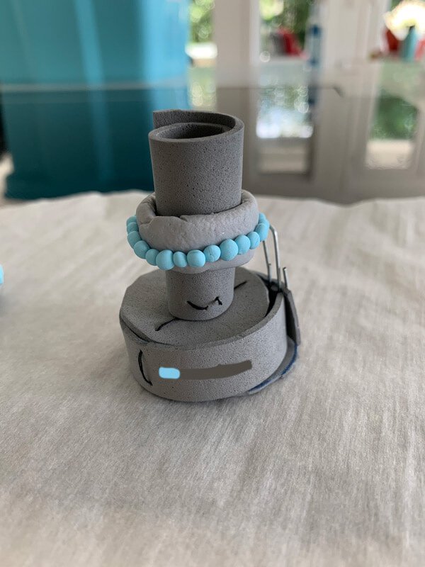
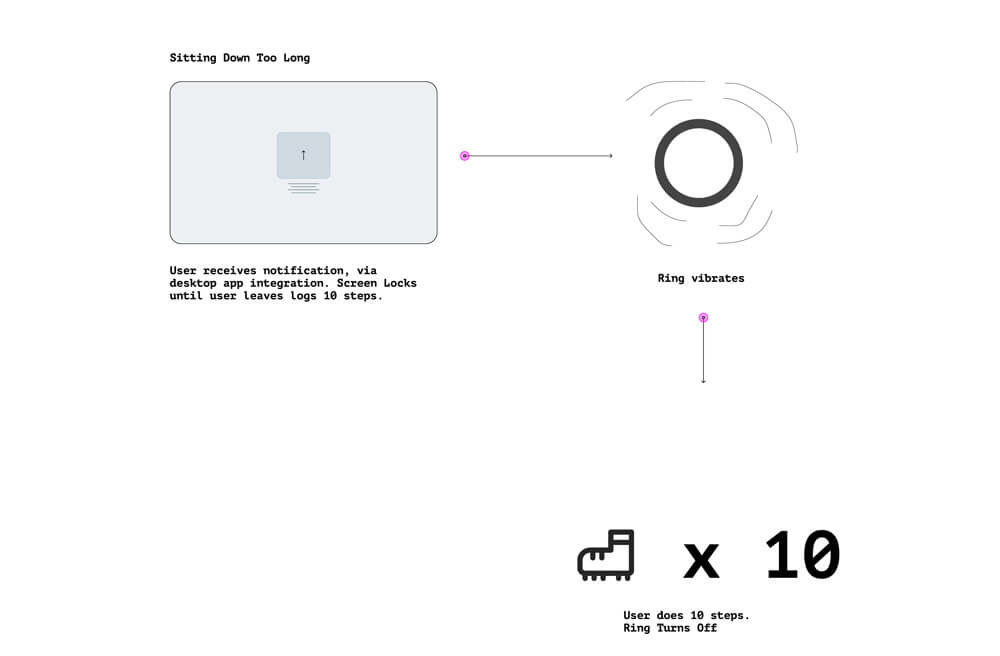
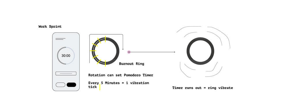
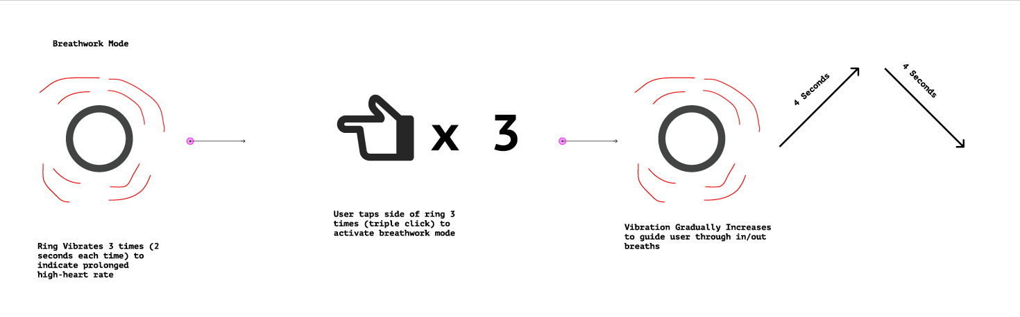
Proposal draft of how the Nootro ring's interface would facilitate the core functionalities of burnout management.
Heuristic Evaluation
1-5 scale (1 not severe - 5 very severe)
#1: Visibility of system status (3.5)
Issues
No visual display on ring
Vibration isn’t the best way of communicating different functions
May be difficult learning curve for the user to understand different vibes
Recommendations
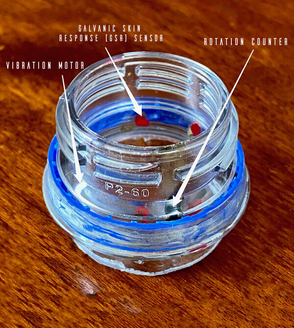
Uses variation of vibration haptics, different intensities and number of times it vibrates
Ability for users can customize the vibrations
Issues
No visual display on ring
Vibration isn’t the best way of communicating different functions
May be difficult learning curve for the user to understand different vibes
Recommendations
Uses variation of vibration haptics, different intensities and number of times it vibrates
Ability for users can customize the vibrations
#2: Match between system and the real world (2)
Issues
Difficulties triggering the voice assistant
Drain battery if used frequently or if the microphone is actively listening while turned on
Recommendations
View Apple’s interface guidelines for products
Utilize fidget mechanism as a dial
Consider adding button or touch sensor to activate microphone when needed
Integrates with mobile devices voice assistant
The spinner is easily discovered through fidgeting
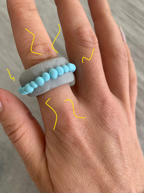
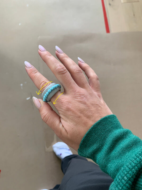
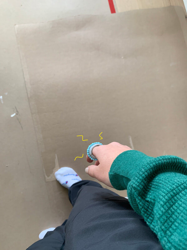
#3: User control and freedom (3)
Issues
User must be explicitly taught how to exit or undo
There are no actions the user can perform on the ring
Recommendations
Perhaps left thump swipe means undo
Down swipe means undo?
Emphasis on onboarding
Extended multi-second tap-hold means exit
Issues
User must be explicitly taught how to exit or undo
There are no actions the user can perform on the ring
Recommendations
Perhaps left thump swipe means undo
Down swipe means undo?
Emphasis on onboarding
Extended multi-second tap-hold means exit
#4: Consistency and standards (5)
Issues
The user will not know what the vibrations are
Learnability is needed
Recommendations
Tutorial on mobile app
Learn by doing
Voice-guided tutorial through speaker?
Issues
The user will not know what the vibrations are
Learnability is needed
Recommendations
Tutorial on mobile app
Learn by doing
Voice-guided tutorial through speaker?
#5: Error prevention (4)
Issues
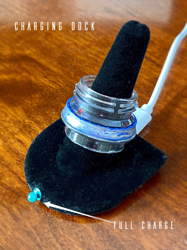
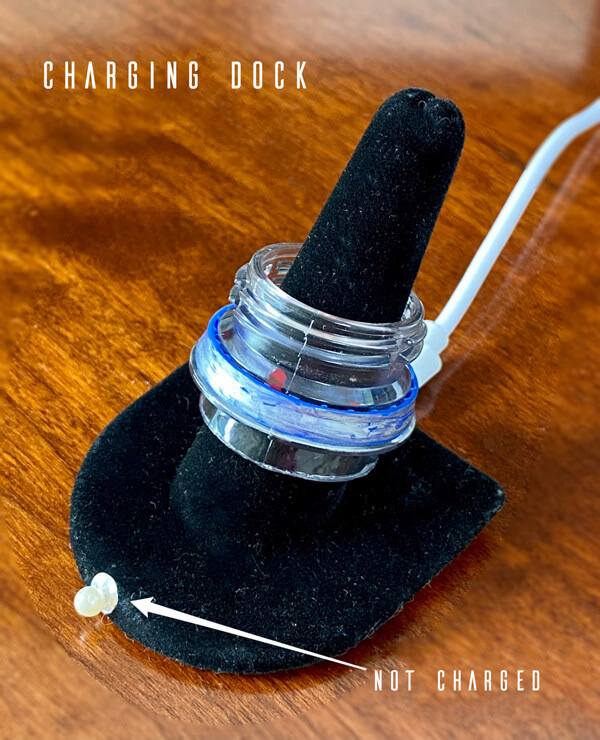
Wireless charging dock pole has to be a different size for every ring size
What if user forgets to charge?
Loss of ring
Recommendations
Instead of having a pole use a flat dock to be used for all ring sizes
Alerts when ring is out of range of phone
Case for ring
Vibration and sound alert for low battery
Issues
Wireless charging dock pole has to be a different size for every ring size
What if user forgets to charge?
Loss of ring
Recommendations
Instead of having a pole use a flat dock to be used for all ring sizes
Alerts when ring is out of range of phone
Case for ring
Vibration and sound alert for low battery
#6: Recognition rather than recall (3)
Issues
Users will have to remember what vibrations mean for different interactions
Recommendations
Users have to know how to read graphs(?)
Limit the ring to only having 3 different vibrations
Issues
Users will have to remember what vibrations mean for different interactions
Recommendations
Users have to know how to read graphs(?)
Limit the ring to only having 3 different vibrations
#7: Flexibility and efficiency of use (1)
Issues
Hard to bridge the gap between novice and power user.
Recommendations
Offload to software, users can easily assign custom interaction gestures.
Offer different colors and textures for the fidget spinner mechanism, they can be swapped out
Issues
Hard to bridge the gap between novice and power user.
Recommendations
Offload to software, users can easily assign custom interaction gestures.
Offer different colors and textures for the fidget spinner mechanism, they can be swapped out
#8: Aesthetic and minimalist design (2)
Issues
Affordances may be hard to comprehend
Not that unique if so minimalist
Fitting components into compact design
Recommendations
Artistic pizazz
Embellishment
Make eye-catching
Create designs of ring around hardware. Hardware first approach
Issues
Affordances may be hard to comprehend
Not that unique if so minimalist
Fitting components into compact design
Recommendations
Artistic pizazz
Embellishment
Make eye-catching
Create designs of ring around hardware. Hardware first approach
#9: Help users recognize, diagnose, and recover from errors (3)
Issues
User may rage-interact not knowing what their input is doing
Users used to visual feedback won’t have any
Recommendations
Phone states the user error in the compatible app
Error messages will have a link to a help center if user needs more information and assistants with the problem
Too many rage-interactions in short time span causes phone notification to enable user to back-out
#10: Help and documentation (4)
Issues
User manuals are complicated and no one looks at them
Non-visual nature of ring makes onboarding non-negotiable
Recommendations
Videos?
Podcast?
Step-by-step audio tutorial
Step-by-step app tutorial
Tutorials
Help bot
Issues
User manuals are complicated and no one looks at them
Non-visual nature of ring makes onboarding non-negotiable
Recommendations
Videos?
Podcast?
Step-by-step audio tutorial
Step-by-step app tutorial
Tutorials
Help bot
Consider for draft UI:
Low battery vibration
First put it on vibration
Breathwork calm down mode
(Vibrates when user becomes stressed out and user must twist the ring one way while breathing, and the breathing intervals begin)
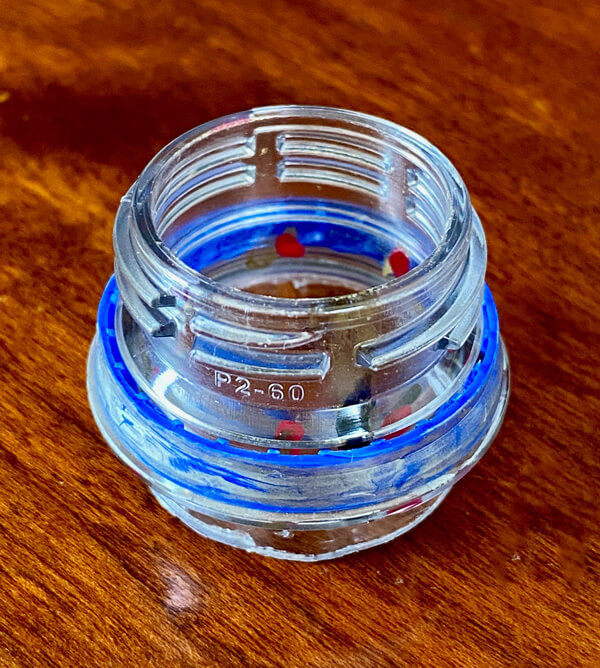
Inner part spins to measure twisting
“Vibration coaching/feedback”
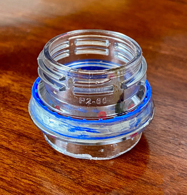
Charging dock
Components
Built in speaker and microphone
Low battery vibration
First put it on vibration
Breathwork calm down mode
(Vibrates when user becomes stressed out and user must twist the ring one way while breathing, and the breathing intervals begin)
Inner part spins to measure twisting
“Vibration coaching/feedback”
Charging dock
Components
Built in speaker and microphone